
A manor house can make you feel two things at once: lucky to stand inside it, and completely unsure what to do next. That tension is the whole point. These homes carry weight, memory, and a strange kind of authority, but they still have to survive Tuesday mornings, muddy shoes, weak winter light, and the modern habit of charging three devices before breakfast. That is where manor updates stop being cosmetic and start becoming common sense.
You do not need to turn an old home into a museum, and you do not need to sand its personality down until it looks like every other expensive renovation online. You need judgment. The good kind. The kind that notices where people naturally gather, where cold air sneaks in, where a grand room feels dead after sunset, and where a lovely detail gets lost because the rest of the space never caught up. Old houses tell the truth fast. They expose lazy choices. They also reward thoughtful ones better than almost any modern build.
The goal is not perfection. The goal is a house that feels grounded, useful, and unmistakably alive. That is how you get rooms worth keeping.
Start With the Bones, Not the Decor
Most people begin with paint cards, curtain swatches, and a heroic promise to “freshen things up.” That is how money disappears while the room still feels wrong. In a manor, the bones decide the mood long before the sofa enters the conversation. Ceiling height, window placement, fireplace mass, door alignment, floor condition, and the way sound travels across the room matter more than your lamp shade opinions. Start there, and your choices begin to make sense instead of fighting each other for attention.
Read the Floor Plan Like a Power Map
A manor house rarely behaves like a new-build, and that is good news if you pay attention. Rooms often have formal proportions, odd transitions, and old assumptions built into them. A breakfast room may catch the best morning light while the so-called main sitting room turns gloomy by four o’clock. The room with the grandest fireplace may also be the one nobody wants to sit in because every chair faces a draft. When you map how the house actually works, you stop decorating fantasies and start solving real problems.
You need to watch movement before you move furniture. Stand in each doorway. Notice where your eyes land first, where people pause, and where they cut corners to avoid a clumsy route. I once walked through a restored country house that looked beautiful in photographs yet felt exhausting in person because every room forced you around oversized furniture islands like a slow obstacle course. Nothing looked cheap. Everything felt irritating. That kind of mistake hides in plain sight.
Good planning feels almost invisible. Doors clear properly. Sightlines land on something worth seeing. Chairs sit where conversation happens naturally rather than where symmetry demands obedience. The best rooms respect how bodies move, not just how photos frame. Get that right, and even modest changes begin to feel richer than expensive clutter ever could.
Fix Movement Before You Buy Anything
Traffic flow sounds dull until it ruins a room. It ruins plenty. A manor can handle scale, but it does not forgive blockage. A table placed five inches too far into a passage can make a whole floor feel stiff. A bench at the wrong angle can turn an elegant hallway into a daily annoyance. Before you order anything large, mark furniture footprints with tape and walk them for two days. That tiny exercise saves embarrassment and back pain.
Movement also shapes mood. When a room allows easy crossing, it feels generous. When every route requires apology, the room feels bossy. You want sequence, not friction. That means leaving breathing room around doors, respecting fireplace zones, and resisting the urge to line every wall with furniture just because the room seems big enough to take it. Space is not emptiness. Space is what lets the good pieces matter.
This is also where many so-called style problems quietly disappear. The room that felt cold often lacked a place to land. The room that felt formal often lacked an easy chair near the right light source. The room that felt scattered often had no clear center. You do not decorate your way out of those issues. You plan your way out, then the styling starts pulling its weight.
Manor Updates That Respect Character While Solving Real Problems
The smartest manor updates do not shout about themselves. They correct discomfort, sharpen function, and let the house keep its dignity. That balance takes nerve because old homes tempt people toward two bad extremes: sentimental freezing or aggressive overcorrection. One leaves you living in a handsome inconvenience. The other strips the place of its point. You want a third path, where comfort enters quietly and the character stays in charge.
Let Period Details Lead the Room
A manor already has a design language. Ignore it and the house will make your new choices look smug. Respect it and even modern additions feel settled. Original cornices, deep skirtings, paneling, uneven plaster, stair curves, iron latches, stone thresholds, and old floorboards all carry visual authority. They set the rhythm. When you let those elements lead, you stop chasing novelty and start building harmony.
That does not mean bowing to every old feature as though age alone makes it sacred. Some details deserve repair. Some deserve retirement. You have to tell the difference. A well-cut original door gives a room identity. A flimsy 1980s faux-traditional archway gives it a headache. I have seen owners cling to bad additions simply because they were no longer new. That is nostalgia wearing a fake moustache. Keep the features that deepen the house. Remove the ones that muddy it.
Materials matter here more than trends ever will. Limewash often looks more at home than glossy paint. A slightly imperfect linen drape can calm a hard room faster than a fussy patterned curtain with no relation to the architecture. A reclaimed oak table tends to earn its place better than something lacquered into self-importance. The rule is simple: choose pieces that seem willing to age beside the house. That willingness reads as confidence.
Modern Comfort Should Hide in Plain Sight
Nobody wins prizes for suffering through a freezing corridor, dim stairs, or a bathroom that treats hot water like a rare privilege. Comfort matters. It just needs better manners. The best updates tuck themselves into the background. Underfloor heating in a stone-floored utility room, improved insulation where it will not trap moisture, discreet secondary glazing, well-placed dimmers, and layered task lighting can change daily life without flattening the building’s identity.
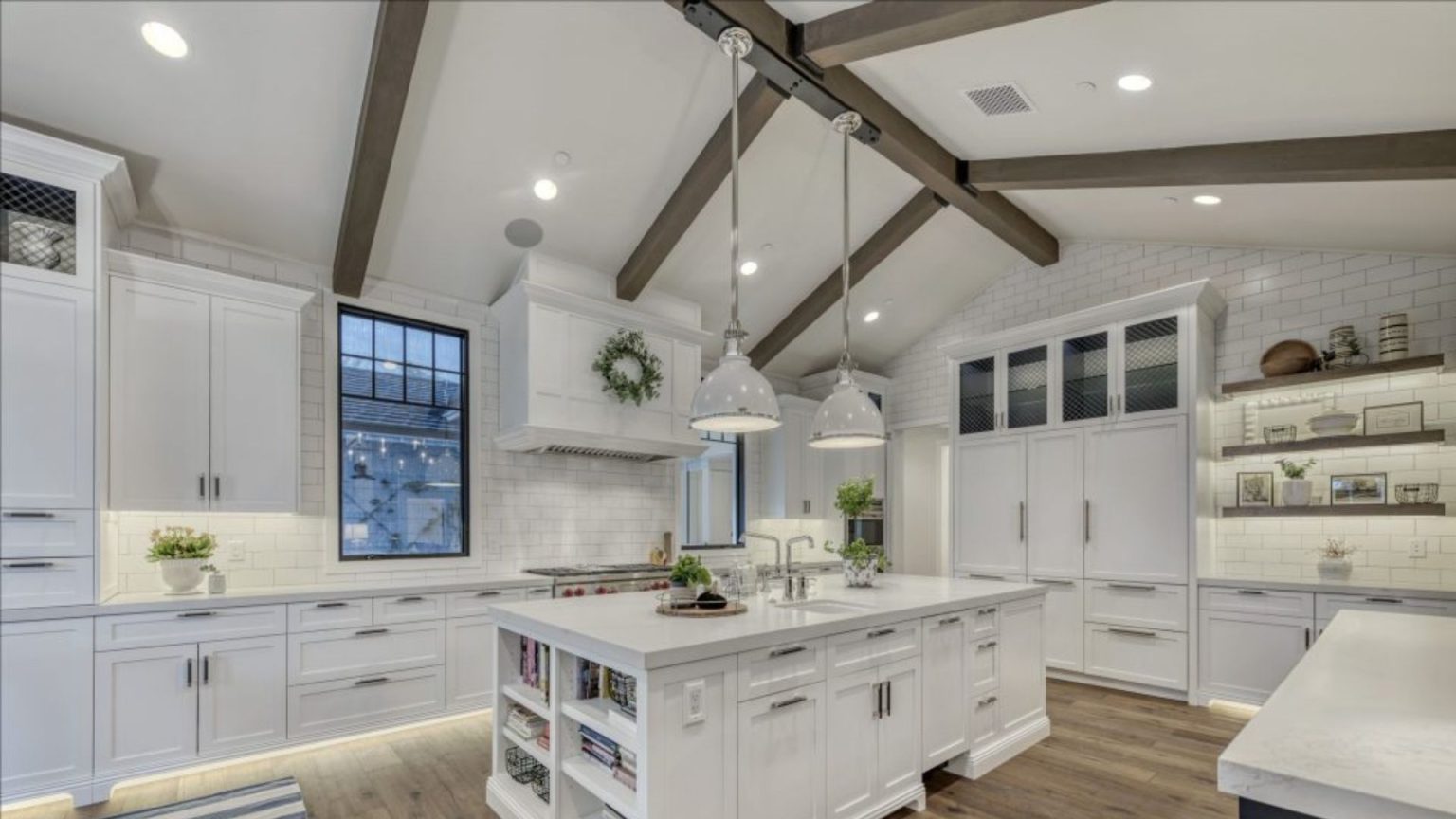
Kitchens and bathrooms demand especially sharp judgment. They carry the heaviest modern expectations, yet they can wreck a house faster than almost anything else. A glossy, overscaled kitchen island may look bold in a showroom, but in a manor it can feel like a nightclub DJ booth landed in the breakfast wing. Better to build around proportion and material honesty. Painted cabinetry, proper storage depth, aged brass, timber, and stone with some restraint tend to settle in far more gracefully.
Technology belongs in these houses too; it just should not perform for attention. Concealed speakers, quiet charging drawers, reliable heating controls, and security that does not turn every doorway into an airport checkpoint all make sense. This is where smart design publishing ideas and practical renovation thinking overlap: the best upgrade is often the one you stop noticing after a week because your life simply runs better.
Better Rooms Come From Better Light, Texture, and Scale
Once the bones make sense and the function stops arguing with the house, you can address the part people usually start with: atmosphere. This is where many manor interiors either become soulful or slide into costume. The difference is rarely money. It is the handling of light, material, and proportion. The room must feel alive at 8 a.m., 3 p.m., and after dinner. If it only works for photographs, it does not work.
Stop Shrinking Big Rooms With Tiny Thinking
Large rooms scare people into making small, timid choices. They buy undersized rugs, polite little lamps, and furniture that looks stranded in the middle distance. Then they wonder why the space feels cold. Scale does not mean stuffing a room with huge things. It means choosing pieces with enough visual authority to hold the volume. A long refectory table, a deep sofa with real seat depth, a tall lamp, or a large artwork can ground a big room faster than six decorative afterthoughts.
You also need layers within large spaces. One giant seating ring around a fireplace often looks formal and functions terribly. Break the room into zones that still relate to each other: reading near the window, conversation near the hearth, perhaps a writing table or game surface in the quieter edge. This makes the room feel inhabited instead of staged. Old houses like purpose. They reward it.
Counterintuitively, larger rooms often need stronger intimacy devices, not fewer. That might be a generous rug, full-length curtains hung properly high, books that take up visual weight, or a darker wall tone that pulls the space inward at night. Big spaces become welcoming when you give the eye somewhere to settle. Grandeur without intimacy gets old fast. That is the secret nobody mentions enough.
Texture Makes Quiet Rooms Feel Finished
Texture does the heavy lifting in old houses because it creates depth without noise. If you rely only on color, you often end up overdoing it. If you rely on texture, the room can stay calm while still feeling rich. Rough timber, brushed metal, old leather, slubby linen, worn stone, wool, ceramic glaze, matte paint, and even imperfect plaster all catch light differently. That difference creates mood. Quietly. Reliably.
This matters even more in rooms with restrained palettes. A chalky wall beside a polished antique chest, a soft wool runner across old boards, or a block-printed cushion against faded velvet can make a neutral room feel layered rather than bland. Too many people chase drama with loud pattern because they do not trust subtlety. Big mistake. In a manor, subtlety has range. It can carry the room further than visual shouting ever will.
Texture also helps create better spaces for actual living because it changes how a room feels under your hand, not just how it looks from the door. That tactile quality matters more than style tribes admit. When a house has weight and history, you want surfaces that invite use, not ones that make people nervous. A home should not feel like a warning label. It should feel like permission.
Make the House Work for This Decade
Charm does not excuse inconvenience. You are not renovating for an imaginary family in 1890. You are making the house earn its keep now. That means storage that hides mess without flattening personality, rooms that support the way you actually spend time, and choices that reduce maintenance drama instead of adding to it. A manor can stay generous and still become sharper, calmer, and easier to run.
Storage Is a Design Decision, Not a Chore
Storage in older houses often gets treated as an afterthought, then resented forever. You see it in the hallway stacked with shoes, the dining room turned paperwork bunker, the kitchen counters buried under machines nobody wants to display, and the bedroom chair sentenced to hold all the “not dirty, not clean” clothes. None of this happens because the house lacks beauty. It happens because beauty without containment collapses under ordinary life.
Built-in storage needs tact in a manor. You want it to look anchored, not inserted like office cabinetry on vacation. Joinery that follows existing proportions, painted cupboards that sit comfortably within alcoves, window seats with concealed drawers, and wardrobes detailed to echo original doors all work because they speak the same visual language as the house. They belong. That feeling matters more than novelty ever will.
There is also freedom in admitting what your life actually requires. If you own bulky sports gear, create a real home for it near the entrance. If children use the back hall as mission control, design for that instead of pretending baskets will fix it. If you work from home, stop balancing your laptop on a pretty but useless occasional table. Honest storage is not glamorous. It is better. It buys back peace.
Create Better Spaces People Actually Want to Use
The final test of any update is brutally simple: do people want to spend time there? A formal drawing room can look dazzling and still sit empty for eleven months of the year. Meanwhile, a modest morning room with the right chair, lamp, and warmth becomes the heart of the house. Use tells the truth. It always does. When a room works, people drift toward it without being instructed.
That means matching rooms to real habits rather than inherited labels. Maybe the old library should become a family media room with books still lining the walls. Maybe the formal dining room should host long Sunday lunches and weekday homework rather than ceremonial emptiness. Maybe a neglected upstairs landing could become the best reading nook in the house with nothing more dramatic than a bench, a lamp, and conviction. Rooms do not care about old job titles. They care about good decisions.
This is the deeper point behind better spaces. You are not trying to impress the house. You are trying to join it. When your updates respect the building, support daily life, and leave room for pleasure, the place stops feeling fragile. It becomes generous. It becomes easier to maintain, easier to love, and much harder to leave. That is when an old home stops being an intimidating project and starts becoming yours.
Conclusion
A great manor interior does not come from throwing money at old walls and hoping taste sorts out the mess. It comes from seeing clearly. You read the house before you style it. You fix movement before you buy more furniture. You protect the details that give the place its nerve, and you quietly improve the parts that make daily life harder than it needs to be. That is the real value of smart manor updates. They make the house feel more itself, not less.
The best part is that you do not need a theatrical overhaul to get there. A stronger layout, warmer lighting, better scale, hidden storage, calmer materials, and a bit more honesty about how you live can shift everything. Old homes respond to judgment faster than they respond to decoration. That is why the right changes age well while trendy fixes start looking tired almost immediately.
So take the next step with purpose. Walk room by room. Notice what works, what drags, and what never gets used. Then make one improvement that solves a real problem instead of staging a fake one. Start there, and the house will meet you halfway.
FAQ 1: What should I update first in a manor house interior?
Begin with circulation, heating, and lighting before you think about cushions or paint. Old houses reveal their priorities fast. When the room moves well and feels comfortable at night, your style choices stop fighting the building and start making sense.
FAQ 2: Can manor homes be made energy efficient without losing character?
Not if you choose the right improvements. Hidden insulation, careful draught-proofing, layered lighting, and smarter zoning cut waste without flattening character. The mistake is chasing showroom perfection. Real success comes from comfort, lower bills, and rooms that still feel lived-in.
FAQ 3: What colors suit a manor house interior today?
Soft stone, tobacco, chalk, deep green, and muddy blue usually work because they echo age without turning dusty. Use one dark note to anchor the room, then let timber and plaster carry warmth while fabrics add ease for you daily.
FAQ 4: Should I keep every original feature in an old manor?
No. Keep what gives identity: doors, mouldings, fireplaces, stair details, and room proportions. Remove awkward add-ons, weak fittings, and fake nostalgia. Respectful editing usually honors the house better than hoarding every cracked element simply because it happens to be old.
FAQ 5: How do I make a large formal room feel usable every day?
Break the room into activity zones with lighting, rugs, and seating depth. A reading corner, a conversation area, and one strong table often beat a single furniture ring. That change makes the room feel welcoming instead of stiff and distant.
FAQ 6: Are modern kitchens wrong for manor houses?
They are wrong only when they ignore scale, sightlines, and materials. Clean cabinetry can sit in an old house if stone, timber, hardware, and lighting echo the building instead of shouting over it. Restraint gives modern function a far better chance.
FAQ 7: What is the biggest decorating mistake people make in older homes?
They rush to fill space. Old rooms need edited confidence, not constant stuff. Leave breathing room around key pieces, and the architecture starts doing half the work for you. When the room can breathe, every strong choice suddenly looks more intentional.
FAQ 8: Can a manor house feel relaxed without losing elegance?
Yes, and it should. Use durable fabrics, forgiving finishes, warm lamps, and seating that invites long evenings. Elegance lasts longer when people can live with it instead of tiptoeing around it. Comfort is not the enemy of beauty; stiffness is.
Related Posts
Ceiling Coffers Versus Beams Which Adds More Visual Impact
A plain ceiling can make a beautiful room feel unfinished.…
Premium TV Installation Kelowna Solutions
Television entertainment has become one of the most important parts…
Home Gym Flooring Options That Protect Subfloor and Reduce Noise
A home gym can expose every weak spot in a…